
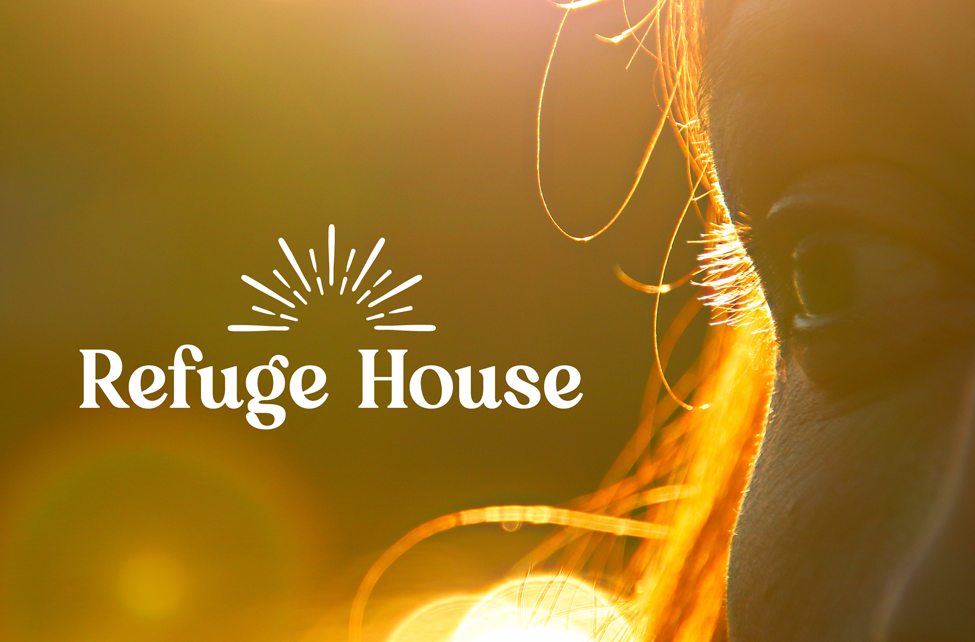
Refuge House
Complete Rebranding, Brand Identity System, Motion Graphic & Guidelines
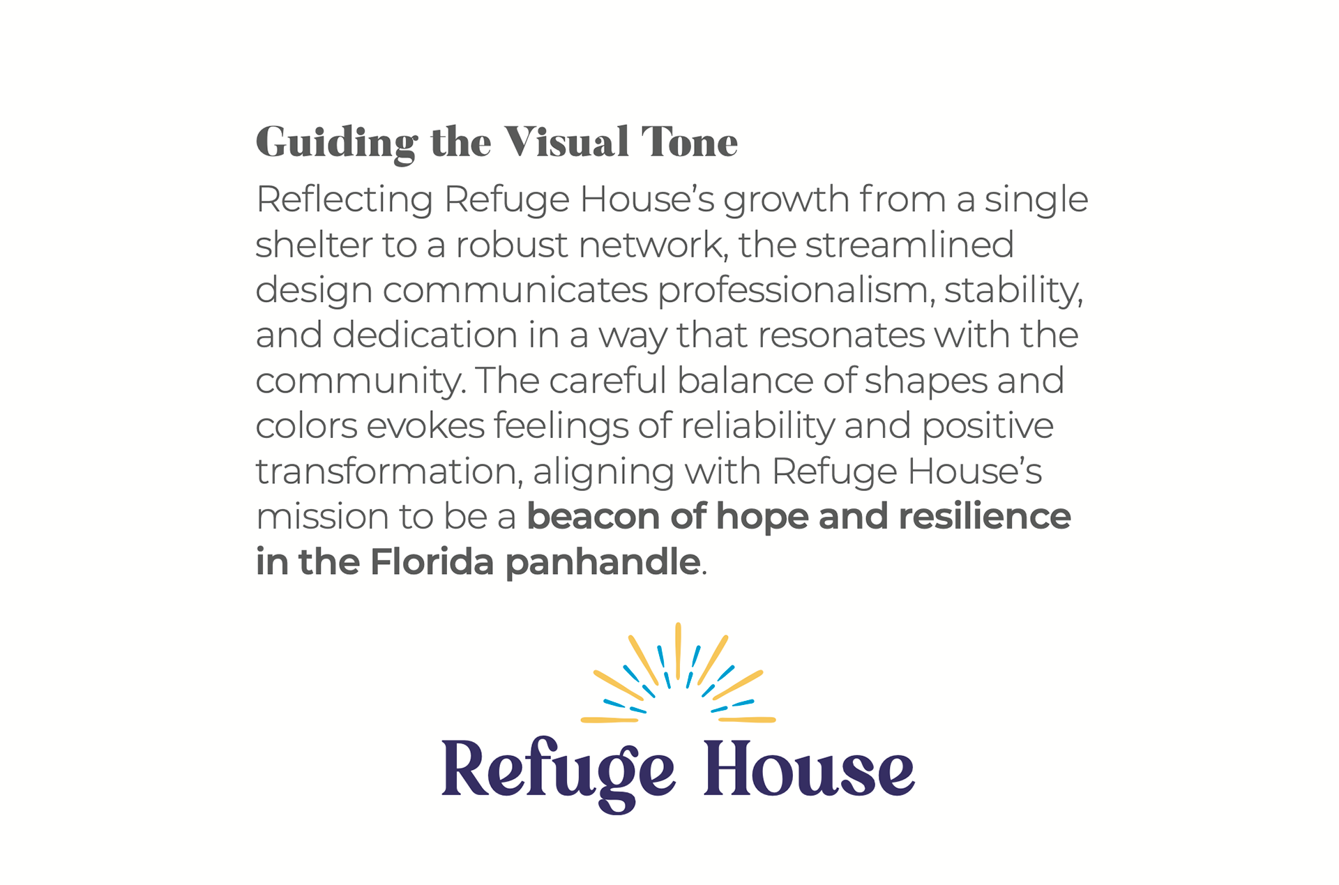
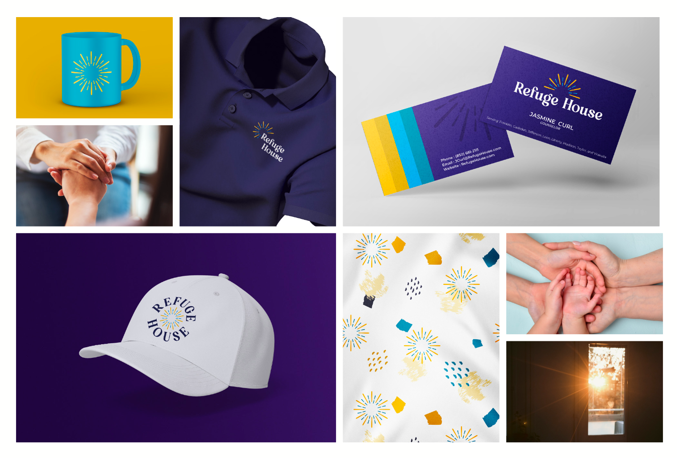
Refuge House, an essential institution serving Leon County and seven surrounding counties in the Big Bend Area of North Florida, was founded in 1978 to provide emergency shelter and comprehensive support to survivors of domestic violence and sexual assault. Marking over 25 years of immense growth and resilience, the organization needed a modernized visual identity that moved away from its legacy imagery a "broken flower within a small house" with a stylized font. The objective was to transition the brand from being perceived merely as a temporary shelter into its reality as a cornerstone institution, creating a rejuvenated presence that resonates deeply with the broader community and those seeking vital services.
Brand Conceptualization & Symbolism
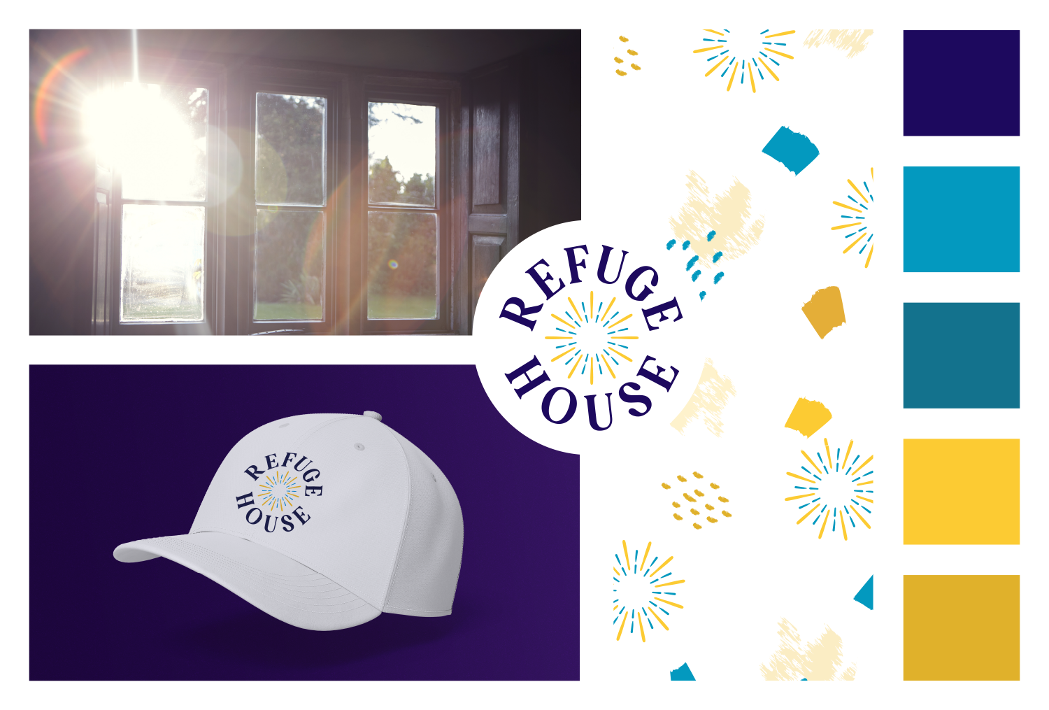
In creating the new brand mark for Refuge House, the design centers around a powerful visual metaphor: after every storm, rays of hope break through. The central imagery features a stylized sun symbol, visually representing warm sun rays entering a safe home to signify the refuge, light, and optimism the organization brings to individuals and families in need. This clean, streamlined design balances corporate professionalism with deep empathy, establishing a consistent visual language across three core configurations: the Primary Logo, a Submark Variant, and a Badge Variant, along with a simplified sun icon designed specifically for small-scale digital and physical environments.
Typography & Intentional Color Palette
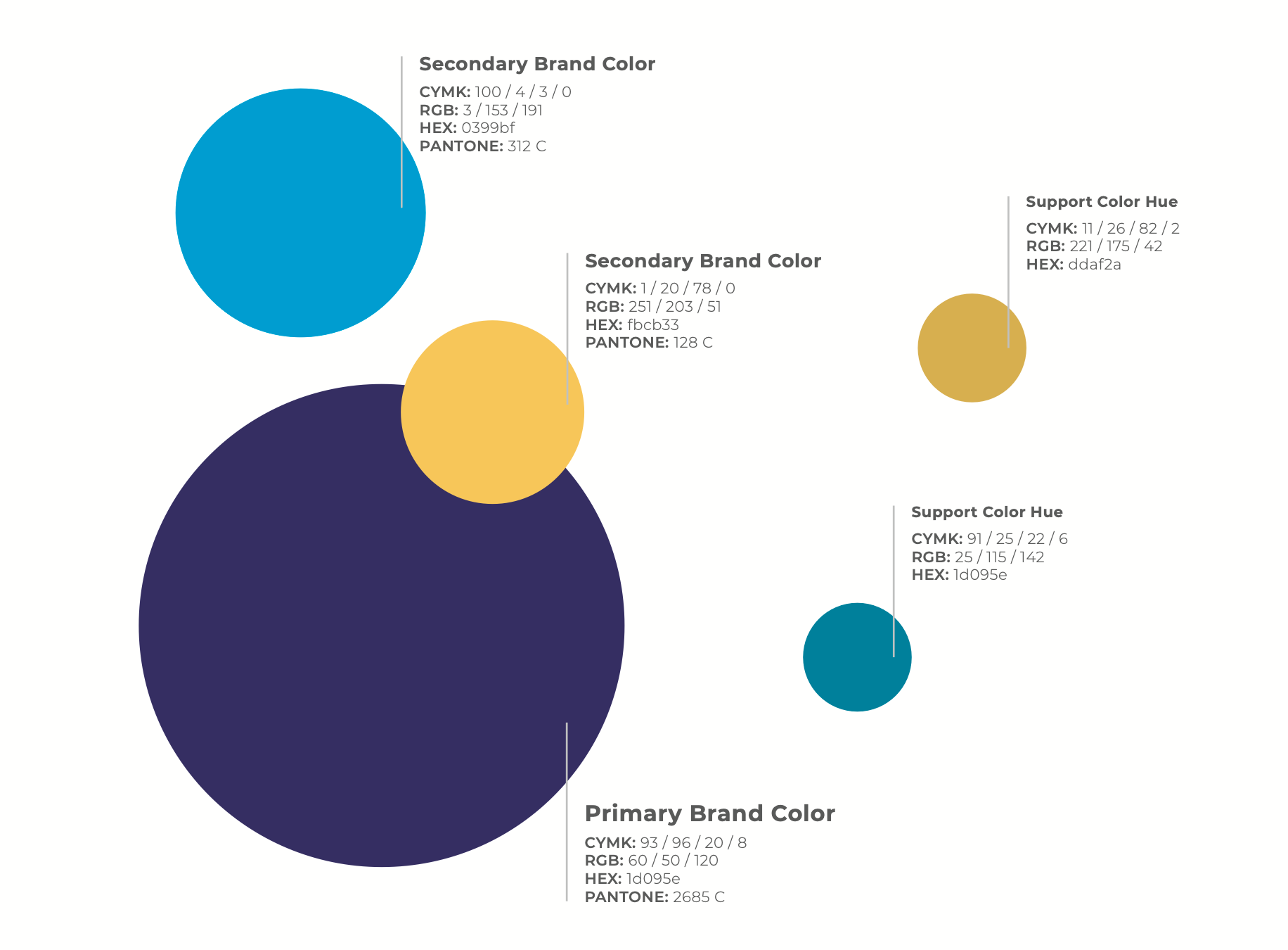
To fortify the brand's supportive and unified message, a synergistic typographic pairing was established. The modern serif typeface Qeldorat serves as the primary font, embodying care and trust, while the clean, geometric Montserrat typeface complements it to provide optimal readability across digital and print formats. The color palette was selected with profound intentionality to reflect the organization's core mission and emotional impact:
• Dark Purple: Symbolizes domestic violence awareness, conveying dignity, resilience, and wisdom.
• Teal: Represents sexual assault awareness, adding a restorative balance of calm and healing.
• Yellow: Acts as a vibrant accent representing sunlight, infusing the visual identity with warmth, positivity, and new beginnings.
System Execution & Touchpoints
Bringing the identity into practical application, a comprehensive Visual Style System and an extensive Brand Guidelines manual were meticulously crafted to eliminate ambiguity and ensure absolute consistency across all organizational touchpoints. The brand system was built for seamless execution across digital media and physical assets, providing precise color-matching specifications and specialized file assets to maintain visual integrity. The final deliverables successfully extended the new identity into the physical world, encompassing corporate stationery, business cards, signage, branded apparel (polos and caps), promotional collateral, and a cohesive imagery framework designed to enhance community impact. The brand guidelines can be seen here.
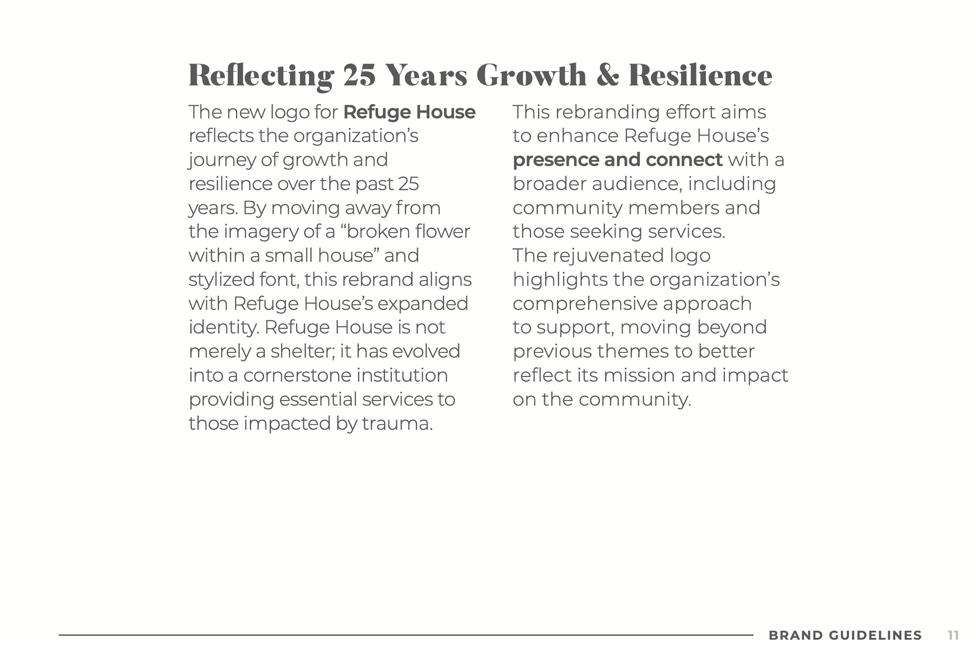
Page 11 from the Brand Guidelines
The Strategic Edge
Consistency is the bedrock of an amazing brand, ensuring every website, logo, or high-stakes event graphic echoes your company’s core values. I don't just design visuals; I build strategic communication systems that meticulously weave your unique story into every digital and physical touchpoint. My commitment fosters a cohesive, compelling narrative that builds instant trust and turns casual browsers into scheduled appointments. Whether maximizing visibility or dominating local businesses, I ensure your brand stands completely alone in the market.
Let's be honest: mediocre branding is an existential crisis your business doesn't have time for. If you're ready to stop blending into the digital background and start looking as good as you actually are, contact me today for a free creative analysis. Let's turn your brand aesthetics into a total market powerhouse.
Let's be honest: mediocre branding is an existential crisis your business doesn't have time for. If you're ready to stop blending into the digital background and start looking as good as you actually are, contact me today for a free creative analysis. Let's turn your brand aesthetics into a total market powerhouse.